
Seven Projects for Seven Years
"Time flies" is an understatement. It feels like I launched Blades Creative *blinked* and BAM, seven years have passed!
A little background, I started my graphic career in Chattanooga. I studied design at the University of Tennessee at Chattanooga, and I had the opportunity to work with my city, countless nonprofits, and local entrepreneurs that gave the city so much life. While working with them, I also realized I was in the same position as many local entrepreneurs.
As they grew their business, I grew mine.
Which inspired me to take the work I was already so passionate about and turn it into a business. I took a leap of faith and started Blades Creative Design Studios in 2015. Today my team serves as the advocate and designer for creative, lifestyle, and wellness brands. Our goal is to bring their purpose and potential out into the world.
While we’ve worked on many different projects through the years, to celebrate, I want to highlight seven projects that were memorable to me.
Let's take it back to 2015!
Fall 2015
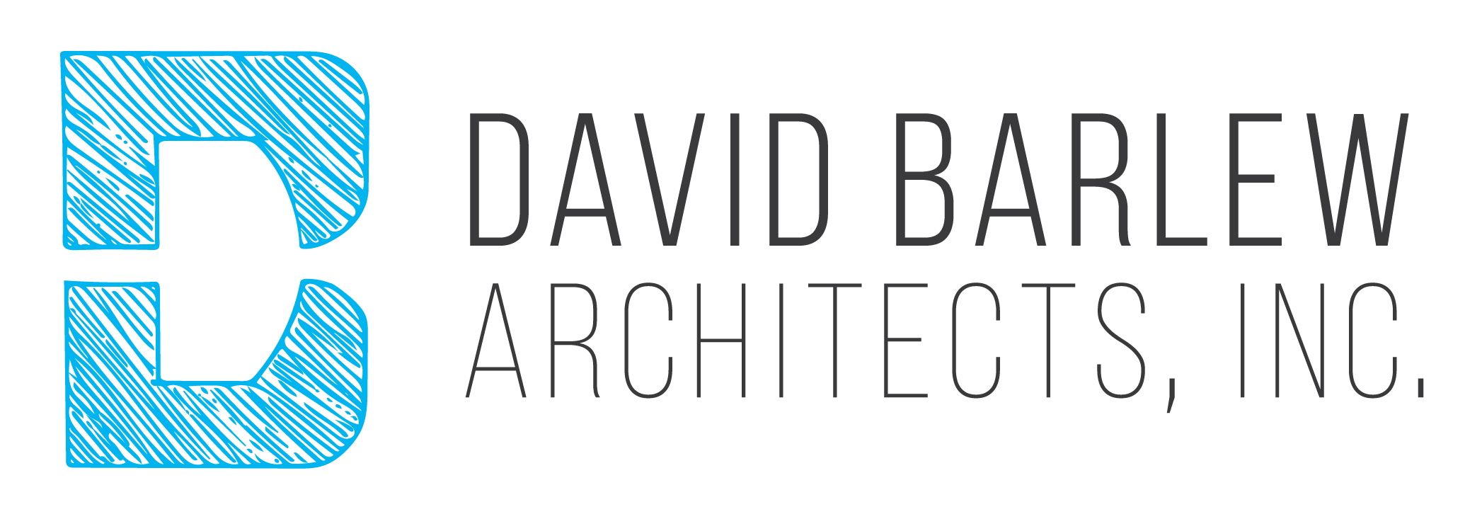
Branding Design for David Barlew Architects Inc.
Fun Fact: This was Blades Creative's first official project! It was such a defining moment. I freelanced for years, but I was excited to onboard my first client as a business.
I worked with David Barlew Architects Inc. to design a brand for a second-generation family-owned business.
David requested something minimal but memorable. After hours of research, many thumbnails, and an open line of communication between David and me, I created a design with an organic appearance.
The final logo was inspired by the client's initials and images found in his architecture textbooks. A few keywords that influenced the logo design were community, maps, family, and structure. One of my favorite things about this logo is that it's open to interpretation. It can be seen as a D, B, a plaza, a window, or even a streetscape!
Finally, it was time for us to decide on colors. David and I worked together on this and visited our local print shop, Wonderpress; we were both immediately drawn to the blue hues and decided on a vibrant blue.
David was a blast to work with, he trusted me throughout the entire process, and the final product gives the potential clients a clear view of the business's brand.
Spring 2016
Branding Design for Perfect Fit Homes
Perfect Fit Homes is another branding project I love sharing.
When approaching this project, I knew I wanted to create a logo that was new to the Real Estate industry and unique to Perfect Fit Homes. My goal was to create a design that was classic yet conceptual.
The tricky part about this project was that the design needed to feel connected to the Keller Williams Downtown Realty logo.
When creating their branding, I was inspired by honeybees. They create perfect hexagon shapes to build honeycombs to live in.
Overall, I'm really proud of this logo. I like the color and how it stands out digitally and in print. I especially like how the design matches the business and its mission to match clients with the perfect home.
Later that month, I worked with Perfect Fit Homes on branding material for a launch event I also attended!
Spring 2017
Branding Design for Children's Advocacy Center: The Emmy Haney House
Next is my project with the Children's Advocacy Center: The Emmy Haney House. This project was definitely a learning experience.
We worked together in the past on fundraising materials, but in May 2017, they approached me for a rebrand. It was my first extensive rebrand, and their beliefs aligned with Blades Creative, so I felt really good about taking this project on.
I wanted to explore the idea of youth, safety, and love which inspired this kaleidoscope concept. However, once we got to the end of the project and the final decision-makers got involved, they wanted a more simplified design.
Looking back, I see why the change happened, but this is still one of my favorite drafts, and I wanted to take an opportunity to share it with you all!
Winter 2017 and 2018
Branding Design and Rebrand Design for LucyDoes
My 2 favorite things about working with small businesses are:
Working with people that align with the Blades Creative mission.
Fostering long-lasting relationships to help them as their business grows and evolves.
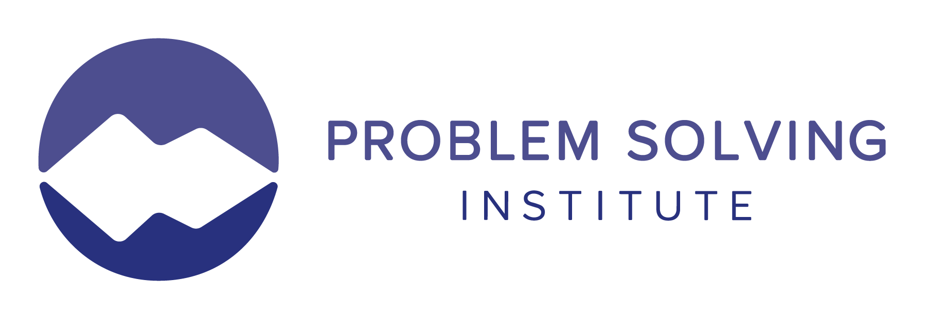
I first worked with Sabrina Moon in 2017 on a logo for her coaching business - LUCY Does, a company that equips clients with valuable problem-solving skills to elevate their business.
Working with Sabrina on this project was incredibly rewarding. I explored a challenging subject matter, made a new friend, and created this logo that truly represents her business!
A year later, Sabrina and I reconnected. She had the same business but changed the name to reflect her business better. Together, we created the new branding for Problem Solving Institute!
This project was a great reminder that rebrands are necessary. Change is inevitable, and your brand should change with you.
Summer 2019
Event Branding and Collateral for Chattanooga - Hamilton County Medical Society
I worked with the Chattanooga - Hamilton County Medical Society on their Denim and Diamonds Fall Ball fundraising event.
They saw my previous work with the Children's Advocacy Center's ACES Casino Night and reached out to hire me for their Fall Ball branding and collateral.
It's a non-traditional fundraising event that started 14 years ago! The themes and dates are always changing, but in 2019, they decided to host a Fall Ball filled with music, dancing, karaoke, and TV.
I wanted to create branding that was fun, warm, and inviting - just like the event, and found inspiration for this project through the season, the activities, and the energy that surrounds the event every year.
I really like how this turned out. When the Medical Society approached me I was thrilled at the opportunity to design a logo and branding material for a night that's so significant to the Chattanooga community and the Medical Foundation.
Spring/Summer 2021
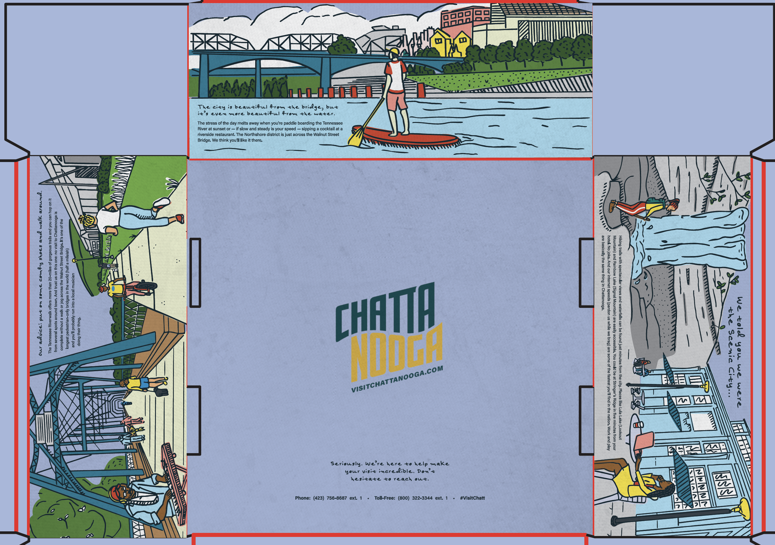
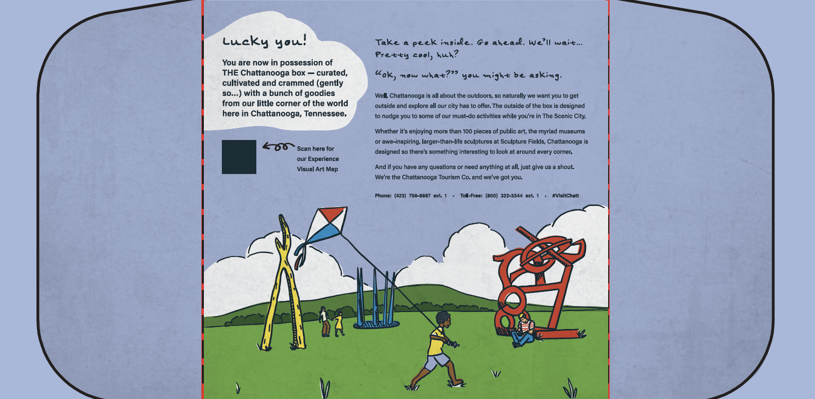
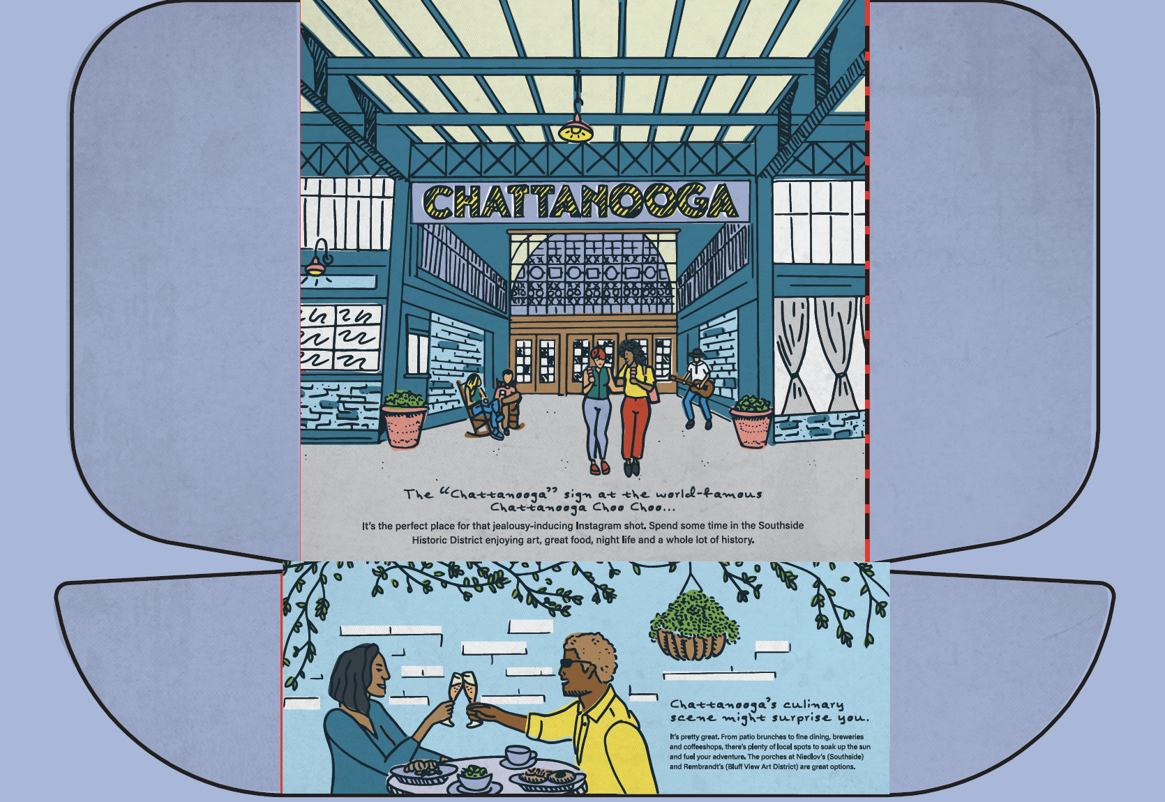
Packaging and Illustration Designs for Chattanooga Tourism
In 2021, my friend Sean approached me for illustration work on a special project.
The project was with Chattanooga Tourism, and I had the opportunity to design a box typically given to VIPs that visited.
This was one of the biggest projects I had ever worked on - it was a hand-illustrated VIP box covered with different activities to do in Chattanooga.
In addition to the illustrations, I helped oversee the box's logistics. It was meant to hold a water bottle, t-shirt, locally made candles, and much more. I worked closely with Jamel Containers to figure out our options and accomplish our goals. Our first task was ensuring we had the right box before I could truly start illustrating.
This project got a little out of hand due to the amount of illustration work, but thankfully, the client was super understanding to get the results we all wanted. The project was so intricate that I recruited the help of my design intern, Priss, who helped me with the color palette and applying color to the illustrations.
Overall, the best and most fulfilling part was that Chattanooga Tourism hired me specifically for my illustration style and work.
Winter 2021/2022
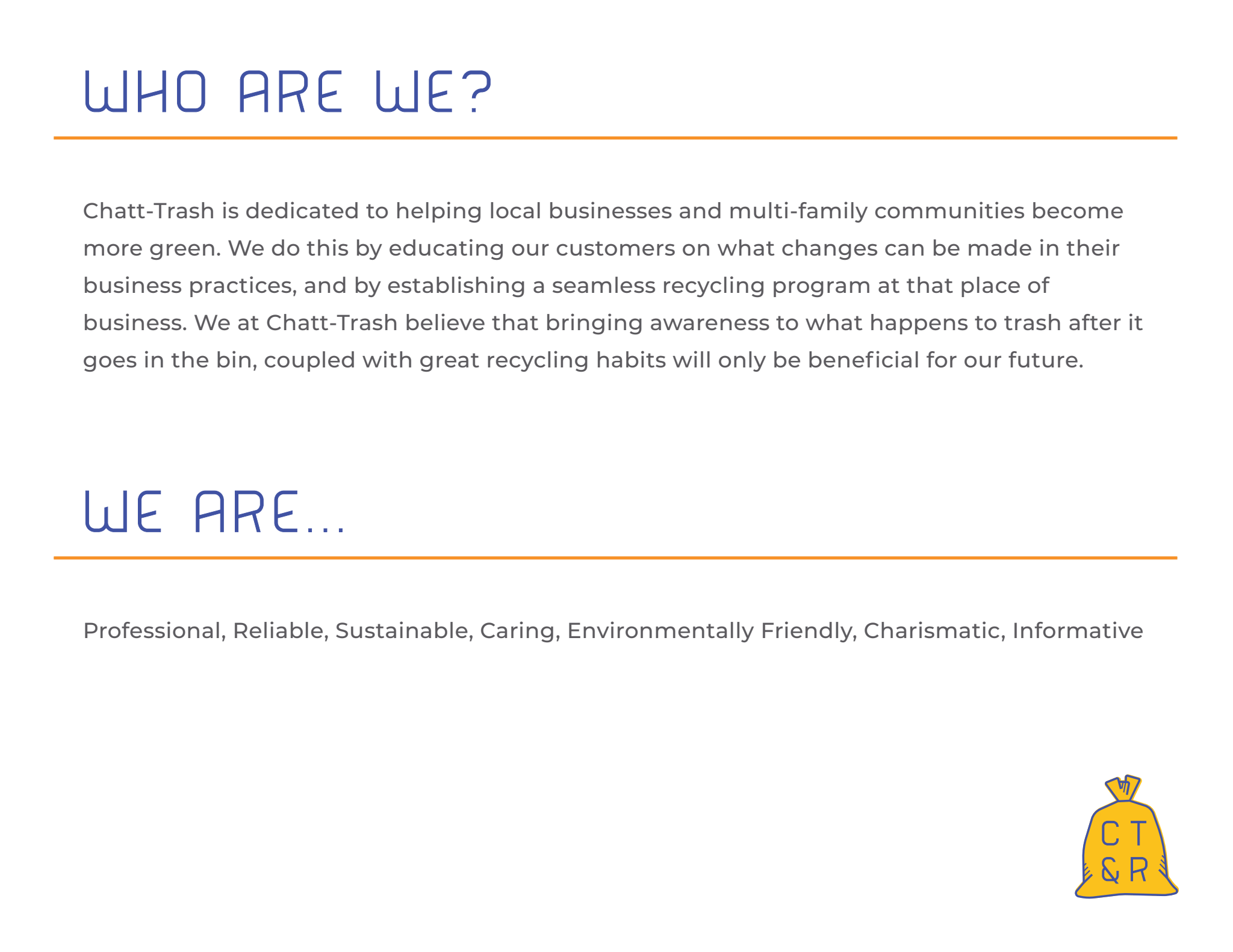
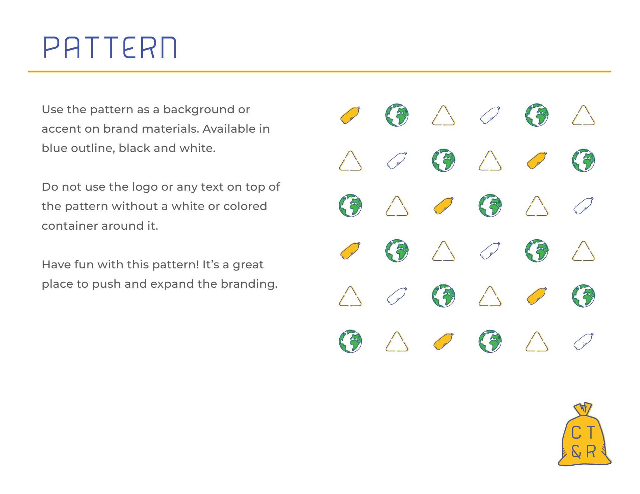
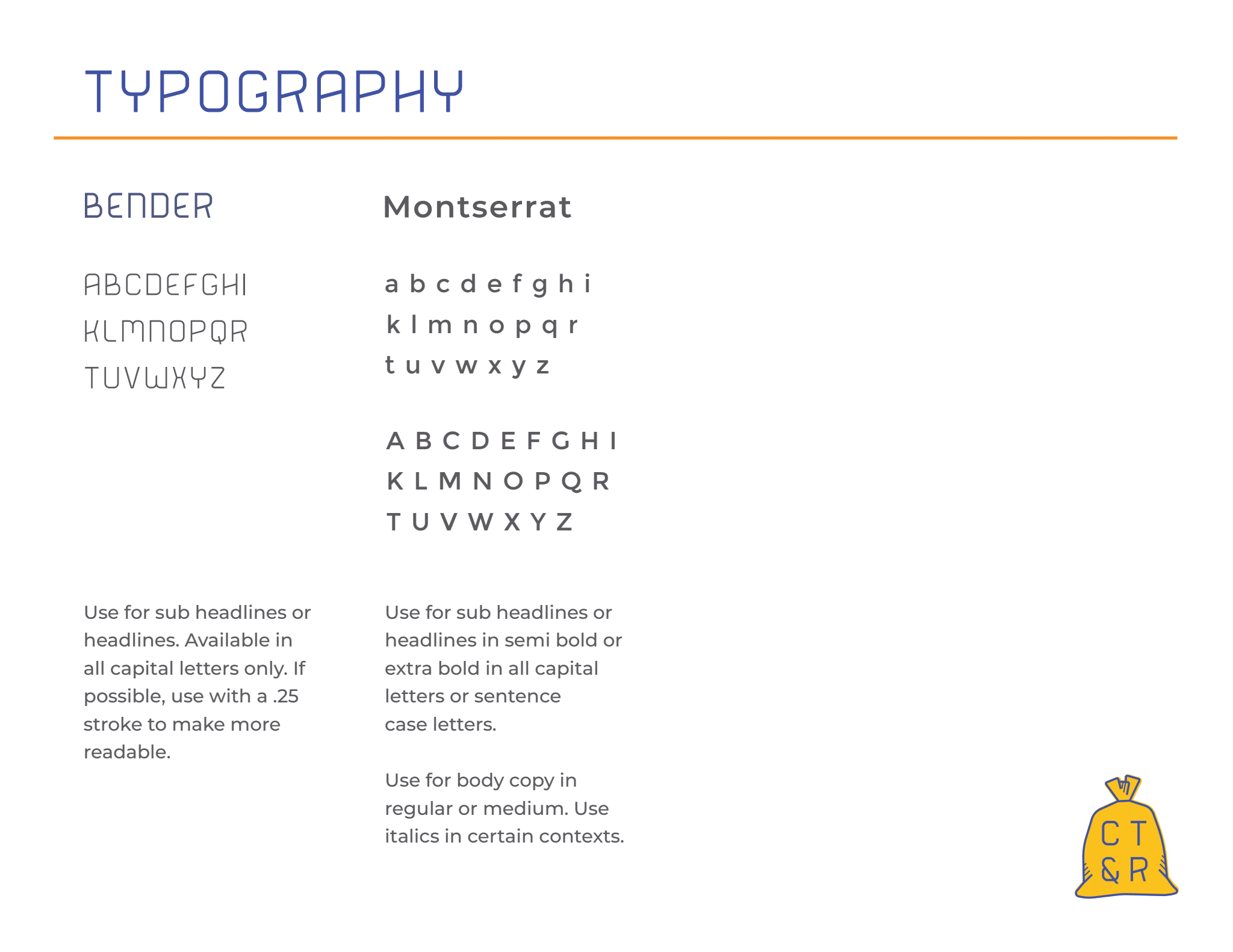
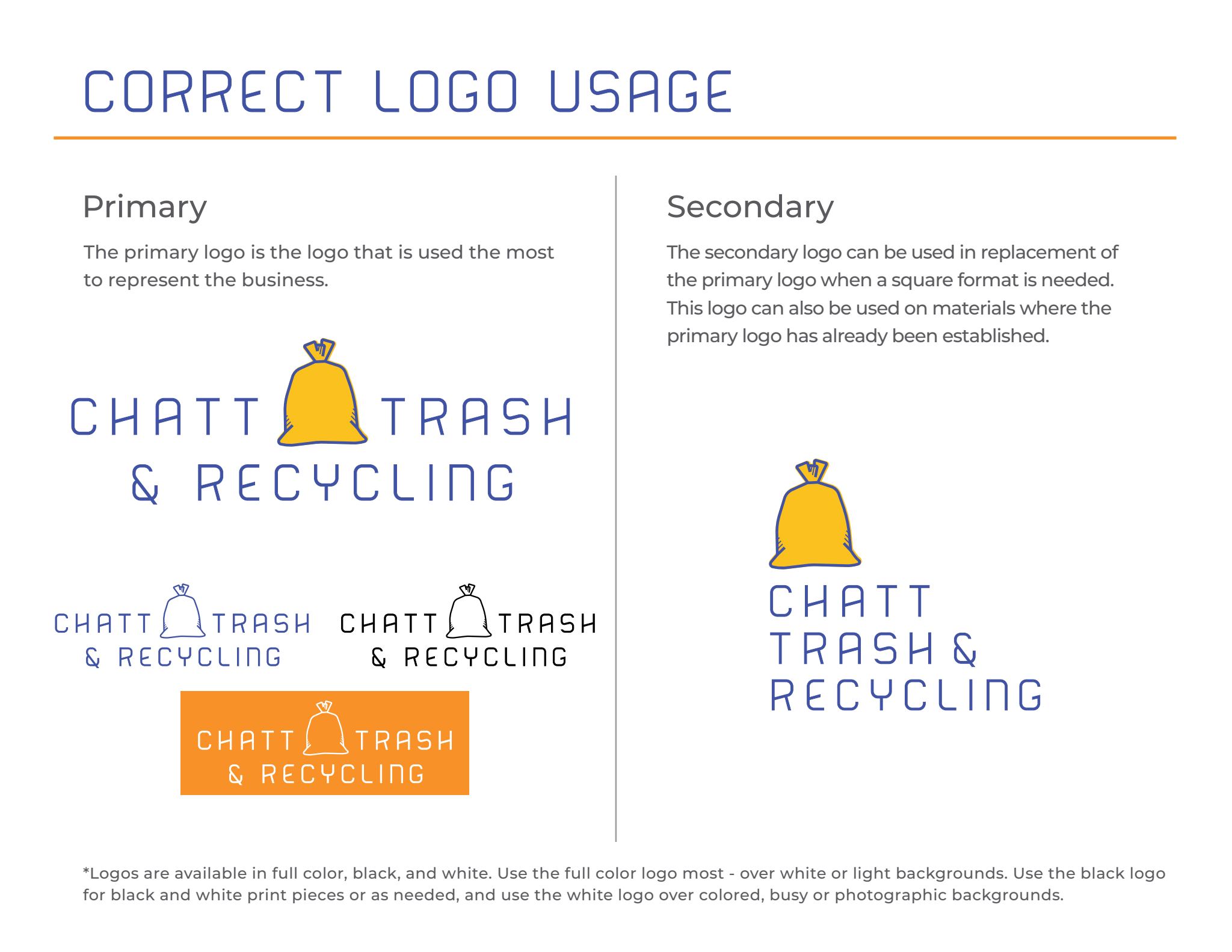
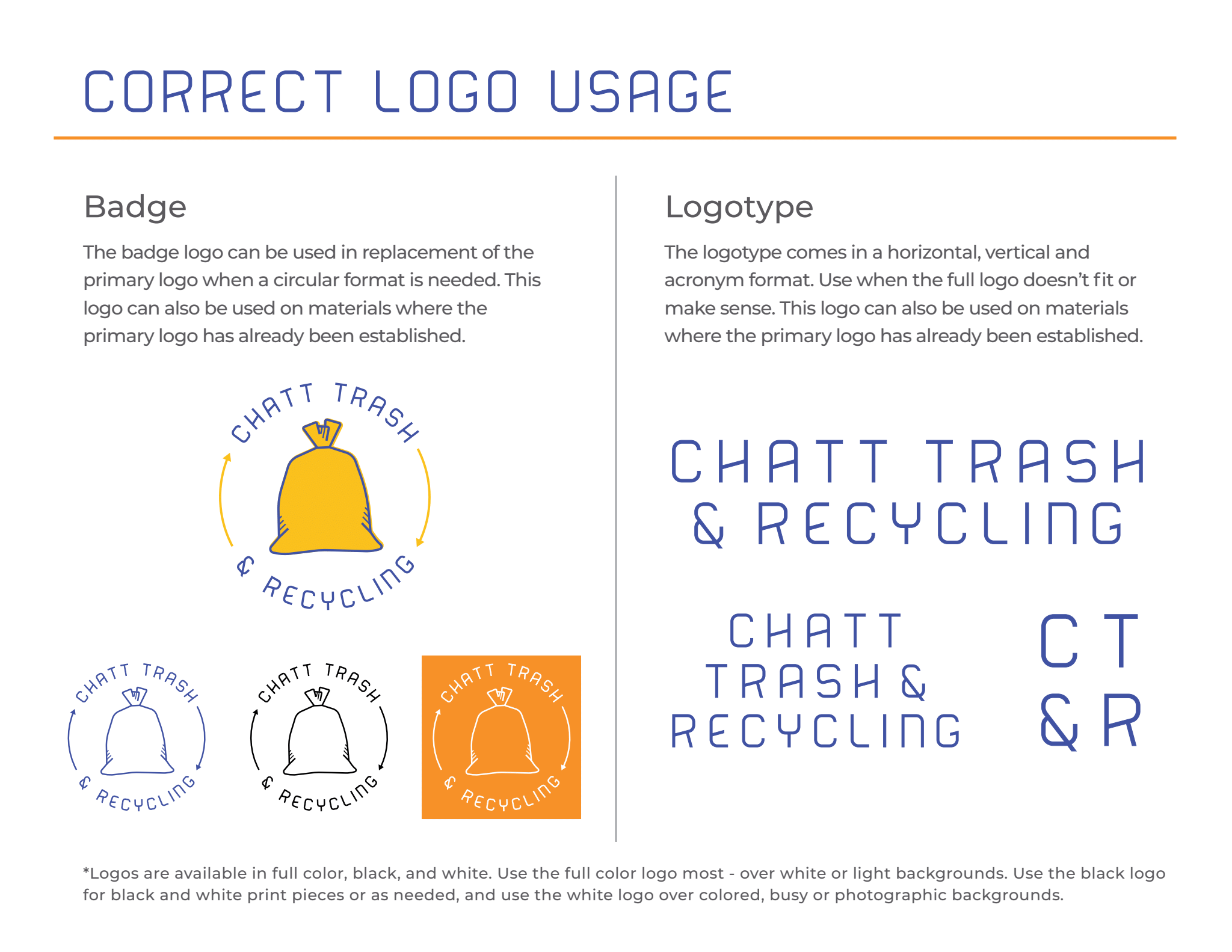
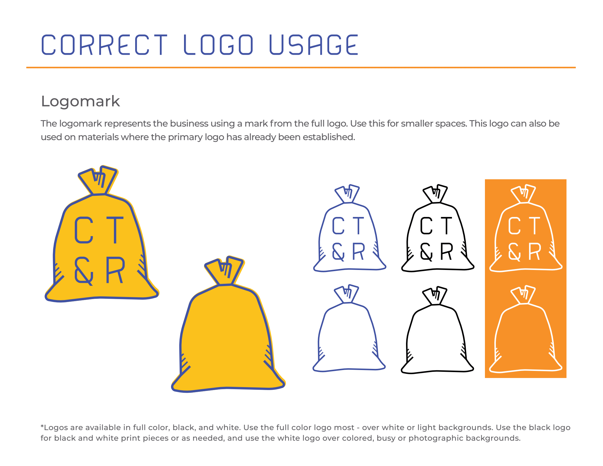
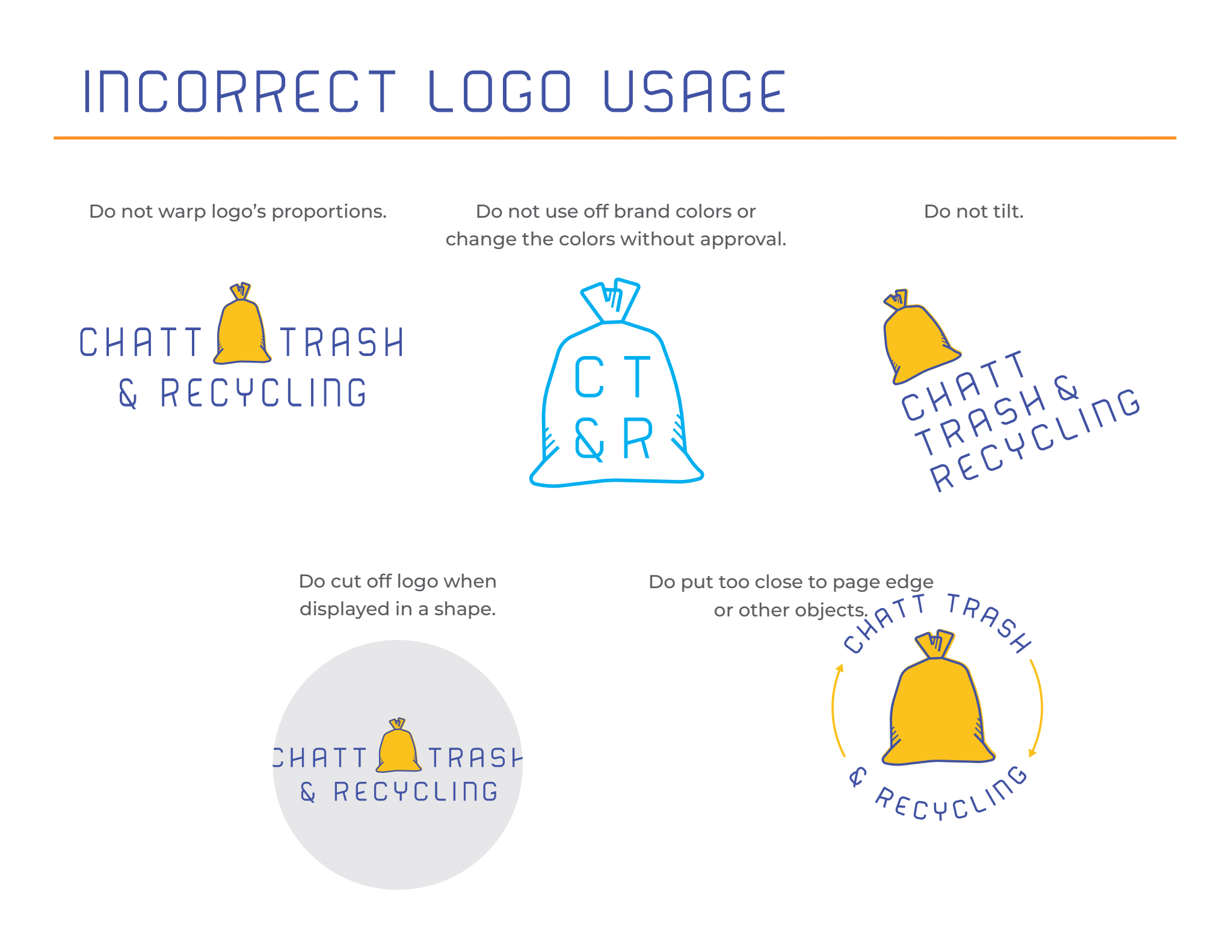
Branding Design for Chatt Trash and Recycling
In 2021 I worked with Chatt Trash and Recycling, and they opted for the elevated brand project. Check out my Behind the Scenes blog to learn more!
Chatt-Trash is dedicated to helping local businesses and multi-family communities become greener. They do this through education and creating a seamless recycling program for their customers.
During our onboarding and initial brand strategy session - we outlined Chatt-Trash's goals, audience, and brand messaging. The client wanted something whimsical yet professional.
I got started right away, and I'm really proud of how this project turned out. The design is whimsical and "trendy," it's also clean, classic, and professional. I enjoy how seamlessly the logo options go together and how versatile the branding is. The colors, logos, pattern, and fonts feel like one unit that can work together with any marketing collateral the client makes moving forward.
While not every project makes it into our portfolio- I'm glad I could reflect on and share just a few of the projects we worked on here at Blades Creative.
I always say that your brand is an extension of your business, and through my years with Blades Creative, so many special people have helped shape my brand.
When Blades Creative launched, I worked primarily within the Chattanooga community. While I still do, thanks to all of you, I also work with people all over the country!
Sending a big THANK YOU to everyone who helped and supported me along the way from my community in Chattanooga, online (yes, Being Boss!), on Instagram, LinkedIn, and now in Austin. Thank you for listening, supporting, and encouraging me!