
Designing Your Instagram Grid to Match Your Brand
We've all heard of the aesthetic Instagram feed, and I love them! I'm obsessed with a brand that can create a cohesive feel post to post. Where each image connects and the brand has the opportunity to shine through and tell its story. Instagram is all about creating; creating posts, engagement, and reels, all to differentiate your brand and business from everyone else.
Did you know that a visually differentiated Instagram grid is how many accounts are able to convert visitors into followers and eventually into customers? Take a moment and reflect on your own habits. When we see an account that we like we’ll spend moments looking at their grid. Within those moments, we’re able to decide if someone's account is interesting, valuable, or relevant enough to follow. So, while posting is necessary, your Instagram grid is a snapshot of your brand's personality. It's basically how you're introducing yourself. Once you introduce yourself and make that first impression, users will start looking at each individual post and reading your captions. A carefully crafted Instagram grid won't make you more discoverable, it will increase the percentage of people who convert into new followers.
How you arrange your images and how they line up on the grid creates an impression on your Instagram visitors. Depending on your goals, your grid can be just as essential as the individual photo. It can be challenging to start building a cohesive Instagram account. I mean, how do you even start? If you haven't thought about it before, creating a cohesive grid can get a little overwhelming. Creating a grid can take some effort at first, but thankfully, there are tips, tricks, and apps to help!
Here are Three Steps to Creating an Instagram Grid that Matches your Brand
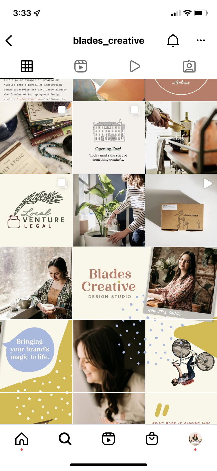
Be intentional with your colors
Last month we talked about developing your brand's color palette. There are many ways to utilize your brand's color palette, from your packaging to your website. Color is one of the most important things for building your brand and your brand identity.
Additionally, colors influence consumer buying decisions by 85% and increase brand recognition by 80% (Hootsuite). So, remember that when you're posting on Instagram. Keep your identity in mind. When you're choosing your brand's colors, choose carefully. Use those pre-established colors if you already have an established color palette, a website, or a logo. If not, I encourage you to read our last blog post to pick a color palette and solidify your brand colors. Once you pick your colors, find ways to incorporate them into your content. It can be subtle, like choosing one color for text and another color for your background. From there you'll immediately start to notice how cohesive your page will look.
Identify your "filters" & font
Next, reflect on what you're posting. Do you use filters on your photos? Filters are photo effects adding images before publishing them. Or do you post graphics with text?
Whether you’re using either filters or graphics, stay consistent. There's power in editing with filters, and the most aesthetic Instagram feed will typically have a specific photo editing style.
If you're a brand that creates graphics or text posts to communicate with your audience, use a consistent set of fonts. By using the same filter and fonts, you're creating a level of familiarity for your audience and consistency within your grid.
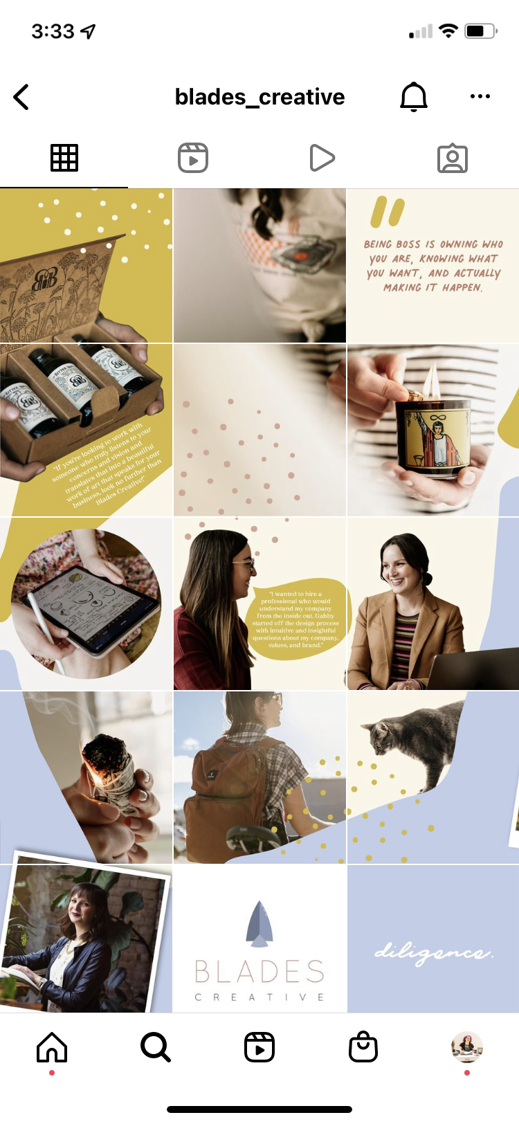
Pick a grid style
Lastly, with your brand colors, filter, and font in mind, it's time to pick a grid style. By knowing how you're posting, you can plan ahead and curate the right content. Remember, Instagram is moving towards a more authentic "feeling," so don't feel too pressured to have the perfect grid, but ensure that you have a layout in mind that fits your theme, personality, and brand.
A couple of different grid styles are:
Checkered patterns: A checkerboard grid layout is dependent on the background colors you choose. These types of layouts have two colors that they alternate between. Additionally, checkered grids don't have to be focused on colors. They can also alternate between different images like a graphic and a photo.
Diagonal patterns: The diagonal pattern can get a little complicated, especially when you start, because you'll need a minimum of 9 posts before your pattern starts to stand out. While this plan requires you to plan ahead, it is relatively easy to maintain.
Row by Row pattern: With the row by row grid, it does require you to think ahead, like the diagonal grid, but it's much more manageable. The row by row concept is that each row tells a story. Thankfully this grid doesn't require as much planning like others, but the only disadvantage is that you have to publish three similar photos at a time, or you'll break your flow.
Other grid examples:
Creating a border around each post.
Color Coding your posts
Puzzle grids where your post cohesively flows into the next post
While you do not have to use any of the three examples listed, it's a great start when creating a consistent "aesthetic" grid.
The most successful accounts incorporate all three tips, from color to filter and font to grid patterns. It's important to design each individual post with your entire feed in mind, and there are so many Instagram planners to help you do just that. For example, Plan, Preview, or Canva. What steps are you taking if you're creating an aesthetic feed?"
Creating an intentional Instagram grid can be intimidating, especially when it's not something you have experience in. Still, if you take it one step at a time and take the time to plan, it can be fun and a great way to represent your brand and tell your brand's story.